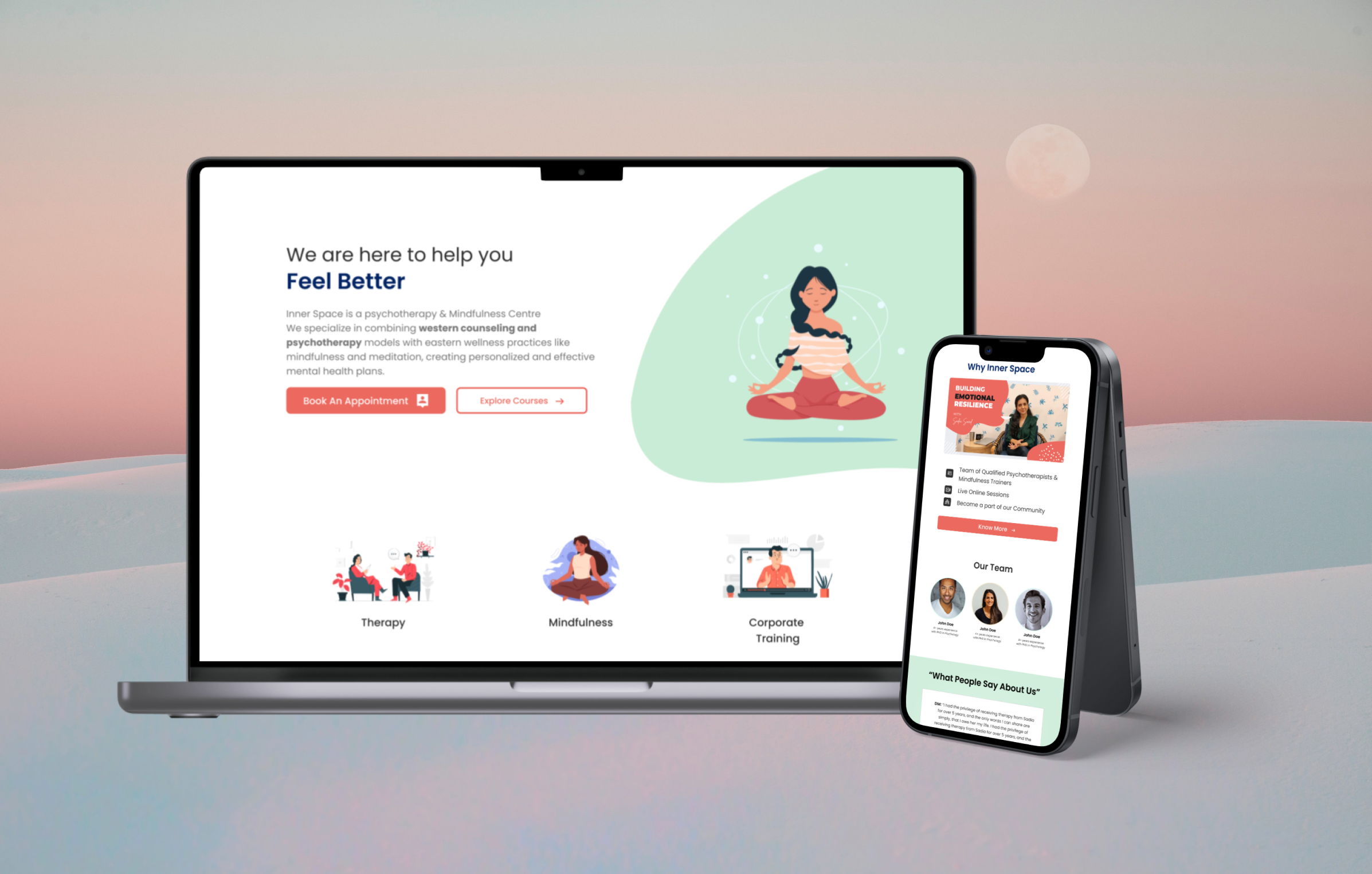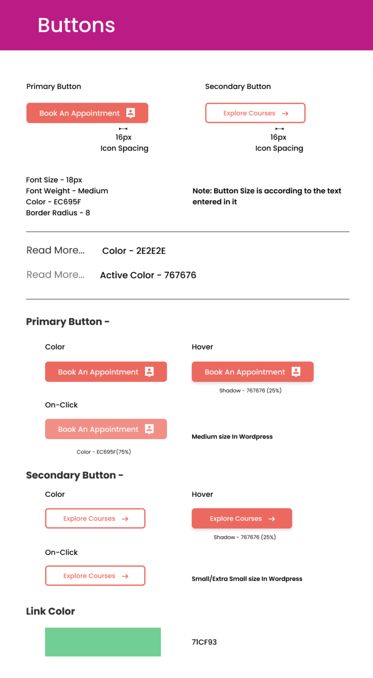
Innerspace, a renowned brand known for its online therapy and mindfulness services, faced a critical design dilemma. Their existing website and design system, while visually appealing, were plagued by inconsistencies, lack of scalability, and poor responsiveness across devices. This fragmented experience hindered user engagement and conversion rates.
As a product designer, I was brought in to lead the redesign of Innerspace’s design system and website, with a focus on enhancing user experience and brand consistency across all platforms.
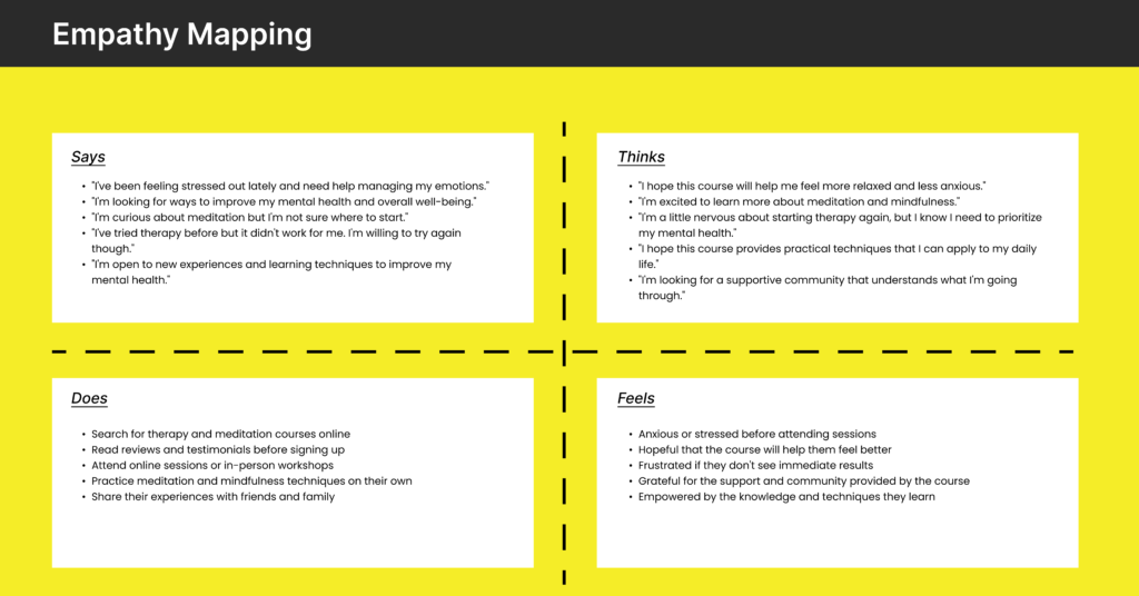
Firstly, I had the talk with the founder understanding their vision and learn about the outputs they want to get with the redesign. Sadia told me that they want to tell people that they came to a safe and peaceful place and people can feel free, comfortable and that they are in the hands of experts. Here are some pointers which they gave me-


During some productive meeting with the client, we engaged in a stimulating dialogue the desired emotional tone of the design. Key themes emerged, emphasizing a sense of calm and tranquility. We further explored the concept of open space, aiming to convey a feeling of safety and security. To translate this vision into tangible elements, I prepared several mockups that embodied these themes and color palettes associated with peacefulness and serenity.


The redesigned design system and website exceeded expectations:
This project was a resounding success, demonstrating the power of a well-designed design system and a user-centric approach to website design. It not only revitalized Innerspace’s online presence but also laid a foundation for future growth and innovation.